When colour is part of the brand: green for PROSIGHT KON 2026
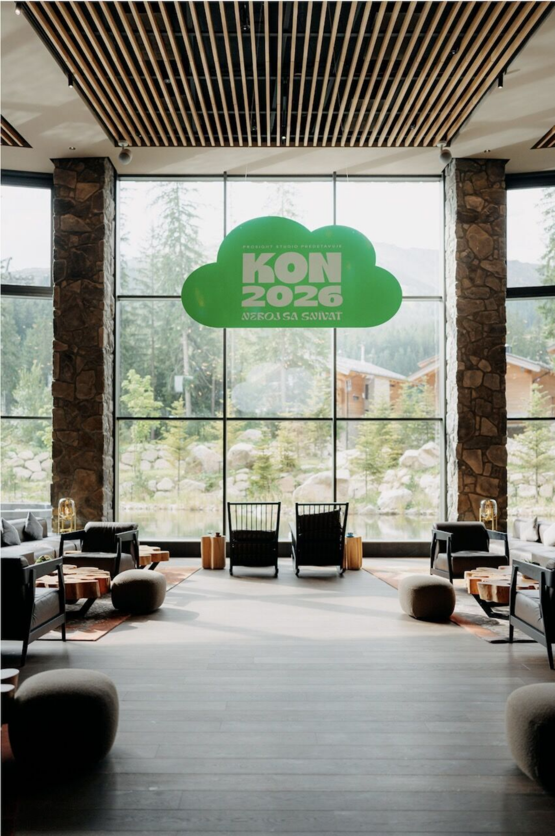
Vivid green connected the passes, maps and signage at PROSIGHT KON 2026. Explore this Kanovits Print Atelier project featuring SuperColour Green.

Vivid green connected the passes, maps and signage at PROSIGHT KON 2026. Explore this Kanovits Print Atelier project featuring SuperColour Green.

Green as a unifying element of the event
A pass at registration, a map in the foyer and signs marking the different zones. At PROSIGHT KON 2026, vivid green connected these printed pieces. At Kanovits Print Atelier, we produced a series of materials featuring SuperColour Green, with colour playing an important role in the event's visual identity.
The event took place on 20 August 2026 at the Damian Hotel in Jasná. At a conference bringing together more than 550 participants, the printed materials had a practical purpose: identifying spaces, providing information and helping people find their way. They also carried the shared PROSIGHT KON 2026 visual identity.
The challenge of bringing a brand colour into print
For a project like this, the design needs to work at different scales. Information read up close on a pass becomes a message for the wider space when it appears on a wayfinding board. Colour remains one of the elements connecting them.
For PROSIGHT, the intense green already had a distinctive character in the design. When bringing it into printed materials, its appearance on the finished piece was therefore a central consideration. Decisions about print become directly connected to how a brand should look beyond the screen.

The solution with SuperColour Green
We used SuperColour Green for this project. At Kanovits, the SuperColour solution draws on the capabilities of the FUJIFILM Revoria Press PC2120 digital press. Its extended colour gamut and specialty toners open up possibilities beyond standard four-colour CMYK printing.
For a project built around vivid green, the ability to work with green toner is particularly relevant. When choosing a print solution, we can consider the shade at the heart of the design together with the substrate and the intended use of the printed piece.
SuperColour also offers other colour and specialty options. In this project, however, the focus is on green and its role within a set of event materials. The properties of the substrate and the appropriate production technique are always considered for each individual item.
The result from passes to wayfinding maps
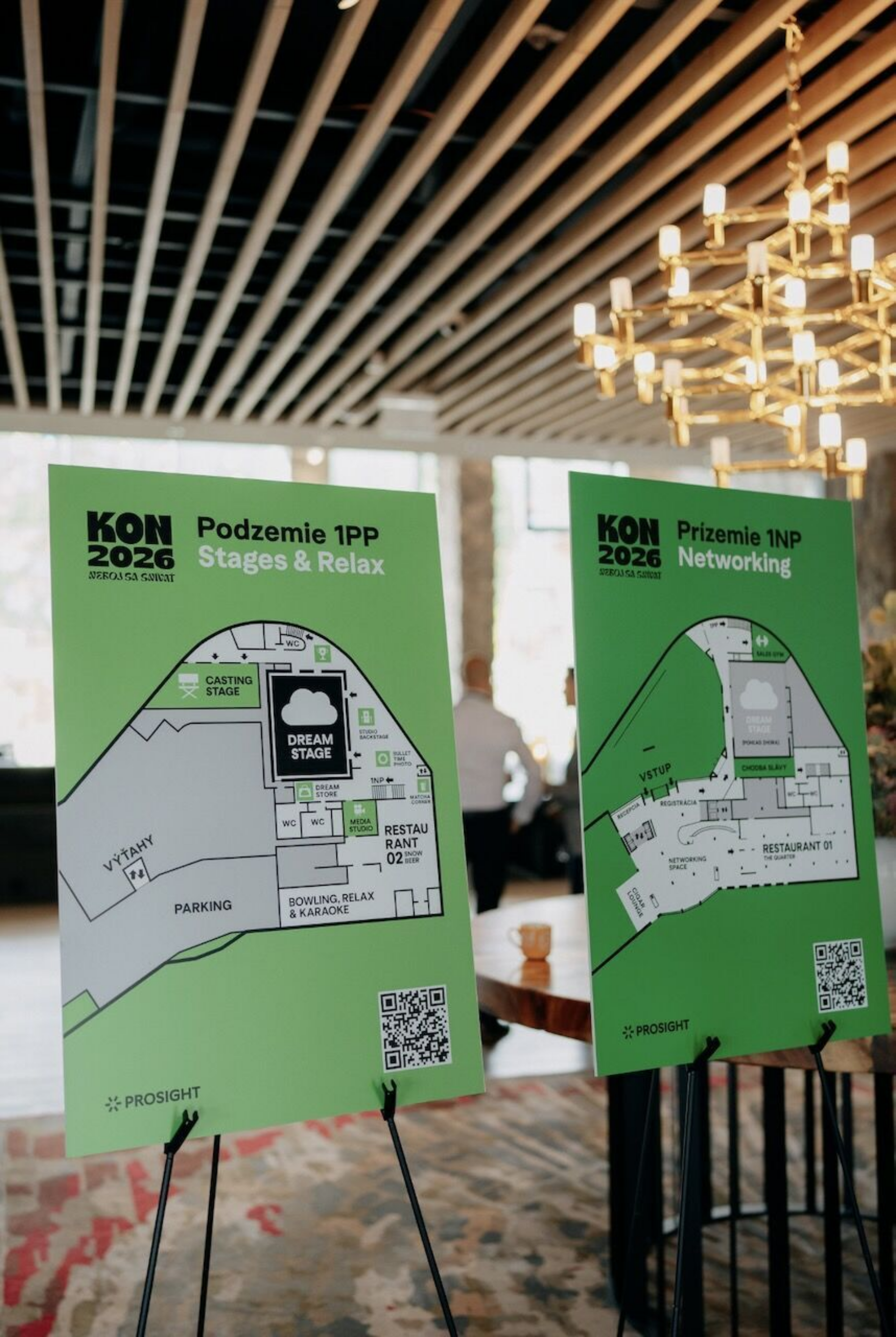
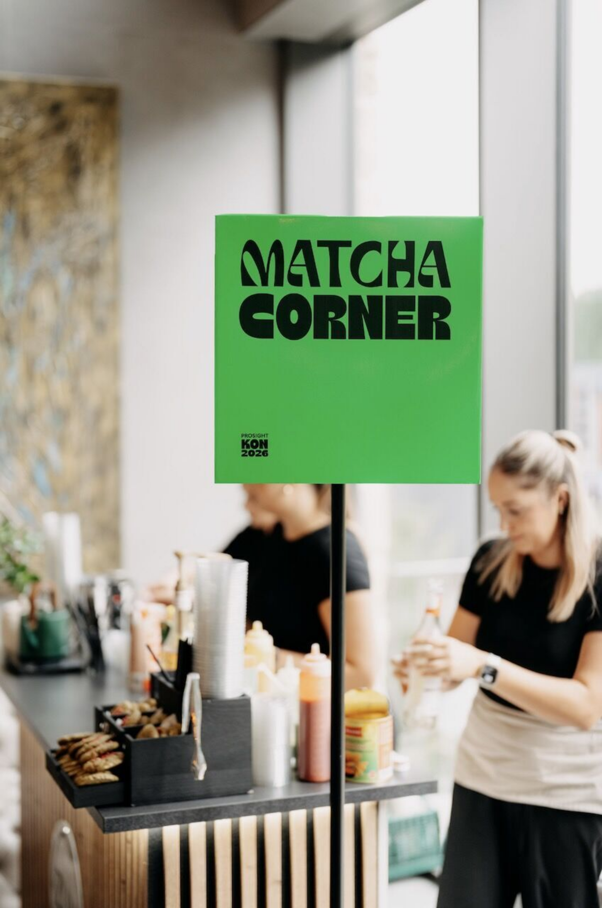
The completed project includes wayfinding and information materials such as maps, passes and signage. The photographs show green passes with black typography, Matcha Corner signage and maps of the individual floors.
Each element serves a different purpose. A pass identifies a participant, a sign helps people find a particular zone and a map explains the layout of the venue. The shared green connects them visually and makes them part of the same event identity.
The PROSIGHT KON 2026 project demonstrates how print can bring a brand into a physical environment. Its role begins with the items visitors hold in their hands and continues through the information that helps them navigate the space.
What to prepare for a similar project
If you are planning an event or campaign built around a vivid colour, it is worth involving your print partner during the design stage. Bring your brand's colour standard, a list of the printed items you are planning and an idea of how they will be used. Together, we can then choose suitable substrates and technologies.
Before production, we recommend reviewing a physical sample. It allows you to see the specific combination of colour and substrate and make a decision based on an actual print.
Planning a project in your brand colours
We will be happy to explore SuperColour options for your passes, invitations, presentation materials and other printed pieces. You can view physical samples and discuss your own design with us.
Email us at info@kanovits.com or explore the possibilities of SuperColour and arrange a demonstration.

Vivid green connected the passes, maps and signage at PROSIGHT KON 2026. Explore this Kanovits Print Atelier project featuring SuperColour Green.
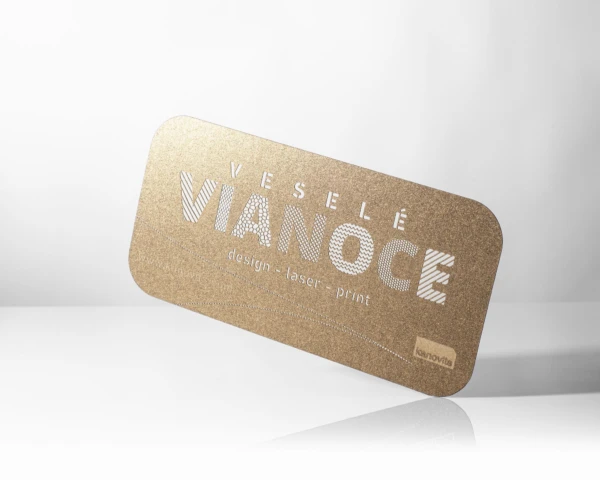
Christmas and New Year greeting cards in your brand’s style. Explore paper, metallic printing, varnishing and laser cutting, with design and production handled in one place.
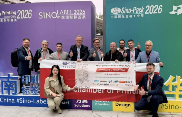
In his own words, Zoltán Kanovits shares his visit to Printing South China 2026, the statue of Bi Sheng, his presentation in Shanghai and unexpected encounters with people from the printing community.
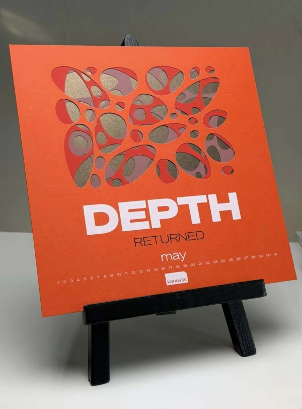
Premium print is not created by a single effect. It is the result of a good idea, the right material, thoughtful design and precise production. Discover what makes a printed piece truly memorable.

At Kanovits Print Atelier, we have officially taken delivery of the Fujifilm Revoria Press PC2120 Super Colour digital press in a configuration that is the first fully equipped installation of its kind in Europe. This technological milestone opens a new space for creativity, innovation, experimentation, and education.

When driving through Dunajská Streda, you can't miss Kanovits Print Atelier billboards. But this is far from a standard local print shop. Founder Zoltán Kanovits lectures at exhibitions and conferences worldwide, and they even prepared the launch campaign for the Dunajská Streda branch of fast-food giant McDonald’s.

The Slovak creative industry gained international recognition at this year's Best of the Best typographic competition in New York. Taking home the main prize against contenders from the US, France, Canada, and the Netherlands was Kanovits Print Atelier from Dunajská Streda.

The founder of Kanovits Print Atelier—a company with nearly twenty years of experience producing premium print products and winning global competitions—started out printing simple posters. Today, owner Zoltán Kanovits is proud of the firm's milestones, history, and international clientele.